Salkku Whistleblower:
Better IA, and UX, for more sales
By redesigning Salkku Whistleblower’s information architecture and user experience, we made reporting faster, clearer, and more intuitive—leading to higher engagement and increased case submissions.
+27%
Reports submitted
-35%
Support tickets
2x faster
Time to value
+20%
Feature discovery
+18%
Direct sales conversions
Information
My role: UX/UI, research
Timeline: 4 months
Tools: Figma, Amplitude, Miro
Client: eSalkku Whistleblower
Overview
Salkku Whistleblower struggled to find new clients outside Finland, hitting a growth wall. Their sales team faced challenges due to poor UX, making it difficult to convert leads. To expand, they revamped the app’s information architecture and UX, improving usability, feature discovery, and ultimately boosting sales.
Challenge
Salkku Whistleblower faced challenges in user adoption and sales due to a cluttered information architecture and a confusing user experience. Reports were difficult to submit, key features were hard to discover, and the sales team struggled to convert leads. To drive growth, the platform needed a streamlined IA and an improved UX to enhance usability, increase engagement, and boost direct sales.
The process and tools
I began the process with usability testing and interviews with existing users and sales representatives to identify friction points in the current IA and UX. This competitive analysis helped me gather best practices for feature discovery, reporting flows, and sales conversions. I concluded that the platform’s navigation and hierarchy need to be restructured to simplify reporting and enhance feature visibility. The submission process needed optimisaiton, key interactions streamlining, and the visual design redefinition. I created and validated interactive prototypes before implementation.
In the image below you can see the tools I used throughout the process, from research and usability testing to design, prototyping, and implementation, ensuring a seamless and effective solution.
User persona
In industries like banking and finance, whistleblower reports are essential for maintaining ethical standards, protecting both organizations and customers from fraud, corruption, and regulatory violations. These industries are highly regulated, and employees often face difficult decisions when they witness unethical behavior - especially when speaking up could lead to personal or professional risks.
I created two personas - Anna Korhonen and Jari Laine. They represent the kind of individuals who might submit a whistleblower report within the banking and insurance sectors. Both are committed to doing what’s right, but their fear of retaliation prevents them from speaking out without the security of anonymity.
Empathy map
Creating both personas and empathy maps was essential to deeply understand the needs, frustrations, and behaviors of the two key users - whistleblowers and investigators. The personas helped define their backgrounds, motivations, and challenges at a high level, while the empathy maps allowed me to break down their thoughts, feelings, and pain points in more detail.
This dual approach ensured that the redesigned platform addressed real user needs rather than assumptions. By working closely with the sales team, I also gained insights into how improving the reporting and investigation process could lead to higher adoption rates, better trust in the system, and ultimately more conversions. Balancing the perspectives of both those who submit reports and those who resolve them was key to creating a seamless and effective user experience.
Nielsen Norman Heuristic evaluation
For this project, I decided to conduct a Nielsen Norman heuristic evaluation to identify usability issues early in the design process. By using this method, I was able to assess the interface against established usability principles, which helped highlight areas for improvement in user experience. This approach ensured that we addressed key issues in the design before moving forward, allowing us to create a more intuitive and efficient product.
Below, you can see the old screens with notes from this analysis, where I pinpointed the exact problems and referenced relevant usability rules. This detailed breakdown helped guide the redesign process and provided clear insights into areas that needed attention to improve overall user satisfaction.
Internal interviews
Participants:
10 interviews with different internal roles - sales, QA, PMs, etc.
Format:
Semi-structured interviews
with predefined questions.
Timeline:
3 weeks for interviews, analysis, and insights presentation.
Creating both personas and empathy maps was essential to deeply understand the needs, frustrations, and behaviors of the two key users - whistleblowers and investigators. The personas helped define their backgrounds, motivations, and challenges at a high level, while the empathy maps allowed me to break down their thoughts, feelings, and pain points in more detail.
Crucial
01
User interface complexity
Overwhelming number of options
Lack of intuitive navigation
Complex filtering mechanisms
"Our customers frequently get lost in the system. They spend more time understanding how to use it than actually solving issues."
02
Technical terminology barriers
Highly technical language in reports
Finnish terminology due to automatic translation
Minimal contextual explanations
"The system assumes a level of technical knowledge that most average users simply don't possess."
03
Inconsistent UX
Varying design across different modules
Inconsistent color coding
Non-standardized information presentation
"Our current UI feels like multiple systems stitched together, not a cohesive product."
04
Reporting and analytics
Complex report generation
Limited visualization options
Difficulty extracting meaningful insights
"Converting system data into actionable business intelligence is unnecessarily complicated."
05
Performance and responsiveness
Slow loading times
Occasional system lag
Inconsistent performance
"Our cloud infrastructure needs significant optimization to provide a seamless user experience."
Other issues
01
Accessibility concerns
Limited support for screen readers Color contrast issues Non-responsive design for mobile platforms
"We're not meeting basic accessibility standards, which could expose us to legal risks."
02
Whistleblower anonymity
Complicated report submission process Unclear anonymity guarantees Potential identification risks
"Trust is our primary currency in whistleblowing systems. Our current design might actually discourage reporting."
03
Integration limitations
Minimal third-party system compatibility Manual data transfer requirements Lack of API flexibility
"We're creating more work for our customers by not providing seamless integration capabilities."
04
Training and onboarding
No built-in tutorial system Extensive manual required High initial user friction
"New users need significant hand-holding. Our system doesn't speak for itself."
05
Limited error guidance
No clear error recovery processes Cryptic error messages Lack of proactive system guidance
"Customers call us frustrated, unable to understand what went wrong or how to fix it."
Branding and design system
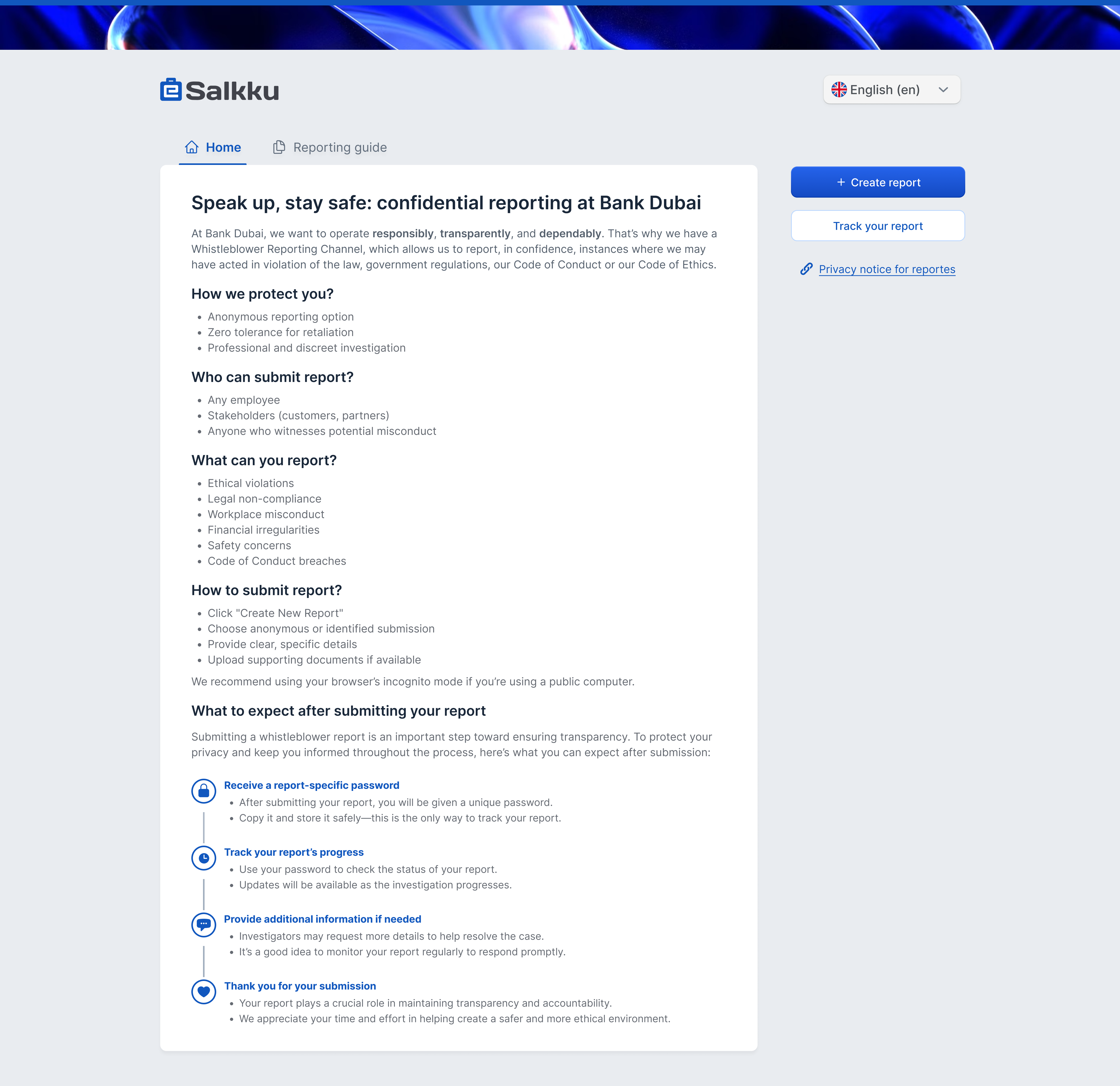
The branding for Salkku Whistleblower is designed to feel modern, trustworthy, and professional. The blue logo establishes a sense of reliability, while the AI-inspired abstract imagery adds a forward-thinking, tech-driven feel. A hint of green subtly reinforces growth and transparency, while a light blue and white color palette keeps the interface clean and approachable. Dark gray text ensures readability and contrast without feeling too harsh. To maintain consistency and scalability, I built a design system that the frontend developers can easily reuse, making future updates more efficient and ensuring a cohesive visual identity across the platform.
High fidelity screens
Creating both personas and empathy maps was essential to deeply understand the needs, frustrations, and behaviors of the two key users - whistleblowers and investigators. The personas helped define their backgrounds, motivations, and challenges at a high level, while the empathy maps allowed me to break down their thoughts, feelings, and pain points in more detail.
Next project
Formula Student
This project developed a formula grading app to streamline evaluations, reduce paper usage, and enhance judge satisfaction for improved business outcomes.
80% reduction in paper usage
50% faster evaluation process
30% increase in judge satisfaction
View project

Let’s create something great together

Have a project in mind or just want to chat about design?
Drop me a message - I’d love to hear from you.
Thank you for your message. I've received it and will reply soon.
Oops! Something went wrong while submitting the form. Please try again.